

How to Check Your Print Proof Before It Goes to Print
July 13, 2026
Why Eco-Friendly Printing Is a Benefit Your Brand Shouldn’t Ignore
August 3, 2026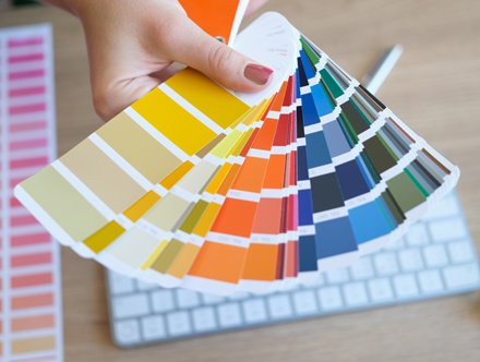
Colour has always been one of the most powerful tools in print design. Before someone reads your headline or studies your branding, they’ve already formed an impression based on colour alone. The right palette can communicate professionalism, creativity, luxury or sustainability in an instant, while the wrong combination can cause even the best-designed marketing materials to be overlooked.
The Most Popular Colours Right Now
Over the last few years we’ve seen clean, muted palettes dominate branding. While those colours remain popular, many businesses are now combining vibrant accent colours to create stronger visual impact. Minimalism still has its place, but introducing richer tones and bolder contrasts can create memorable printed materials without overwhelming the design. Whether you’re investing in brochure printing, business card printing, leaflets or roller banners, choosing the right colours can make all the difference.
Choosing Colours For Your Printed Marketing
The most successful print designs use colour to communicate a message. Deep greens and earthy neutrals continue to grow in popularity, reflecting sustainability and wellbeing. Rich navy blues remain a favourite for professional service businesses, conveying trust and expertise, while charcoal and warm greys provide a clean, contemporary alternative to black. Brighter colours are being used to draw attention and inject energy into printed materials, and are ideal for highlighting calls to action, promotions or key information.
Colours Should Reflect Your Brand
While it’s tempting to embrace the latest design trends, the most effective printed materials remain true to your brand identity. Colour is one of the quickest ways to communicate your personality and values, often before a customer has read a single word. Whether you want your business to feel premium or approachable, forward-thinking or environmentally conscious, your colour palette should support that message. By using consistent colours across your printed marketing you create a stronger visual identity that helps customers recognise and remember your brand wherever they encounter it.
Don’t Be Afraid of White Space
One design trend that’s certainly here to stay is the confident use of white space. Many people assume that leaving areas of a page empty means wasted space. In reality, it often has the opposite effect. White space allows colours to breathe, improves readability and helps important messages stand out. It creates a cleaner, more premium appearance that feels less cluttered and easier to digest.
Metallic Finishes Continue to Grow in Popularity
One of the biggest opportunities in modern print isn’t simply choosing great colours, it’s enhancing them. Metallic gold and silver finishes continue to grow in popularity across luxury brands and corporate marketing. Used carefully, they add depth and sophistication that simply can’t be replicated on screen. With the introduction of our new Xerox Iridesse Production Press, CM Print can now produce stunning metallic effects, fluorescent colours, white and clear speciality inks.
Print Colours Look Different to Screen Colours
One of the most common questions we receive is why colours sometimes look different once they’re printed. Digital screens display colour using light, whereas professional printers reproduce colour using ink. This means certain bright colours that appear vibrant on a monitor may appear slightly different in print. That’s why it’s important to design print artwork using CMYK colour mode and work with professional printers who understand colour management and proofing.
Consider Texture as Well as Colour
Great print isn’t just visual, it’s tactile too. The paper stock you choose can have just as much impact as the colours printed on it. Uncoated stocks often soften colours and create a more natural feel, while silk and gloss finishes enhance vibrancy and contrast. Adding finishes such as Spot UV, embossing or metallic dry inks can also highlight logos, headlines or imagery. These subtle touches help create printed materials that people want to pick up and keep.
Colour Consistency Matters More Than Ever
Customers should instantly recognise your business whether they’re looking at your website, opening a brochure or receiving a compliment slip. Maintaining consistent colours across every touchpoint reinforces your branding and helps build trust. This consistency becomes particularly important when printing multiple marketing materials together, such as brochures, leaflets, business stationery and exhibition graphics.
Expert Printing Services in Brighton
At CM Print, we help businesses throughout Brighton and across the UK produce high-quality printed materials that stand out for all the right reasons. If you’re planning your next print project and would like advice on colour, finishes or design, get in touch with our experienced team today.


CM Print Online Shop: Quick and Easy Professional Printing
Read more