
Business Card Design Trends for 2026
May 6, 2026
Print Marketing Ideas That Build Customer Loyalty
June 1, 2026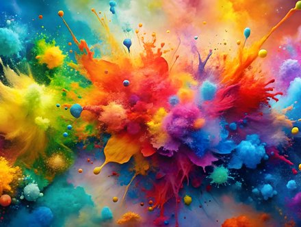
Preparing Artwork for Printing
One of the most common questions we hear in print design is: “Why do my printed colours look different to what I see on screen?” The answer almost always comes down to CMYK vs RGB. Understanding the difference between these two-colour modes is essential when preparing artwork for professional printing. Whether you’re creating brochures, business cards, or leaflets, using the correct colour setup can make a huge difference to the final result.
What is RGB?
RGB stands for Red, Green, and Blue. It’s the colour mode used for digital screens, including phones, laptops, tablets, and televisions. RGB creates colour using light, which allows screens to display very bright and vibrant colours. This is why designs often appear more vivid digitally.
RGB is ideal for:
- Websites
- Social media graphics
- Digital advertising
- Video content
However, RGB is not designed for professional printing.
What is CMYK?
CMYK stands for Cyan, Magenta, Yellow, and Key (Black). This is the standard colour mode used by professional printers. Unlike RGB, CMYK works with ink rather than light. Colours are created by layering inks during the printing process. This means some colours visible on screen simply cannot be reproduced exactly in print.
Why Colours Change When Printed
Many customers are surprised when bright neon blues or vivid greens appear slightly duller in print. This happens because RGB has a wider colour range than CMYK. Professional Brighton printers always recommend designing print artwork in CMYK from the beginning to avoid unexpected colour shifts later.
Why CMYK Matters for Print-Ready Artwork
If you’re preparing files for:
- Flyer printing
- Brochure printing
- Business cards
- Leaflets
- Posters
- Roller banners
your artwork should always be supplied in CMYK colour mode. This helps ensure colour accuracy and consistency across all printed materials.
Tips for Better Print Colour Accuracy
To achieve the best possible results:
- Design in CMYK from the start
- Use high-resolution images (300 DPI)
- Avoid overly fluorescent colours
- Request printed proofs where possible
- Work with experienced printing professionals
Print design is about more than what looks good on screen, it’s about understanding how colours reproduce physically.
Professional Printing Services in Brighton
At CM Print, we help businesses prepare professional print-ready artwork for everything from brochures to business stationery and large-format printing. As experienced Brighton printers, we ensure colours, finishes, and materials work perfectly together to achieve high-quality results every time.
Get in touch today to discuss your next print project with our expert team.

How to Design the Perfect Roller Banner
Read more